Final Product
Design System
December 2025
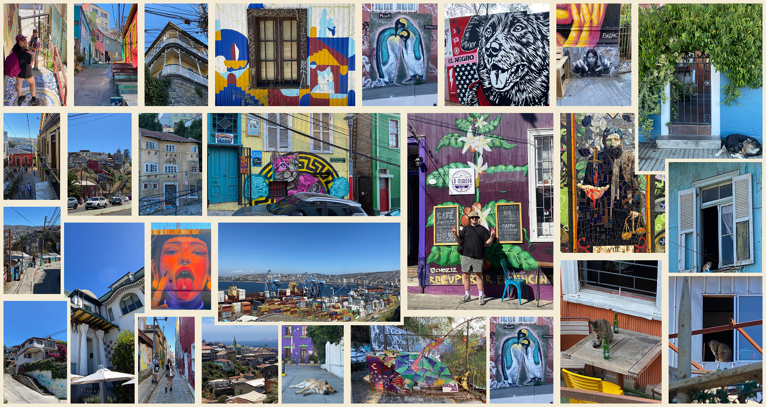
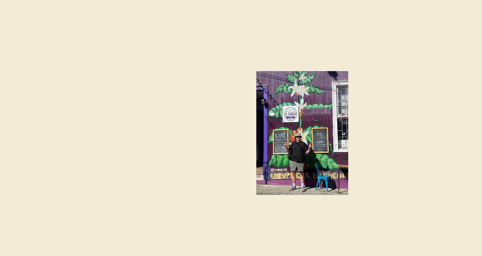
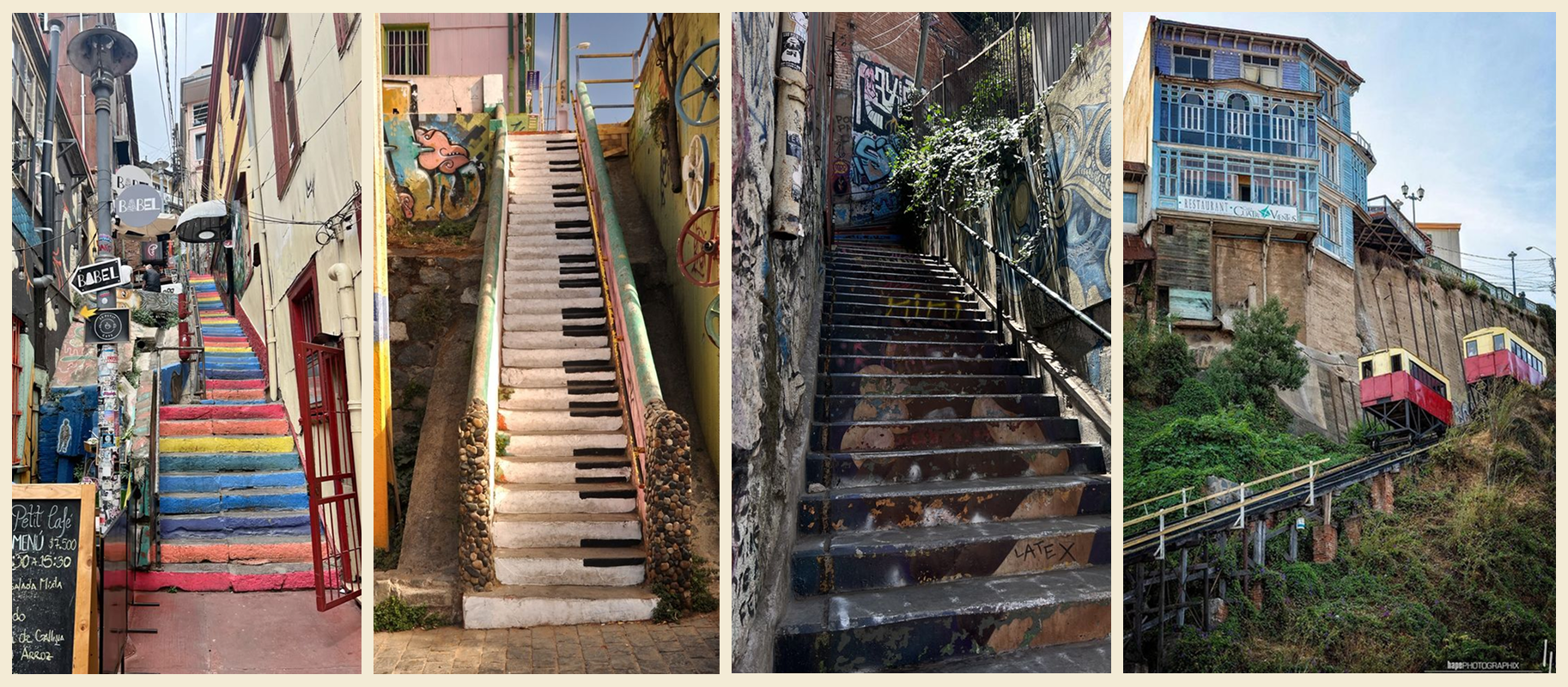
To celebrate christmas and new years – my wife, Camila and I went to Chile last year. My wife is from Chile, and has been to Valparaíso many times, so she knew all the cool places. We went to Valparaíso to visit friends and walk around. We had an absolute blast – here are some pictures we took.
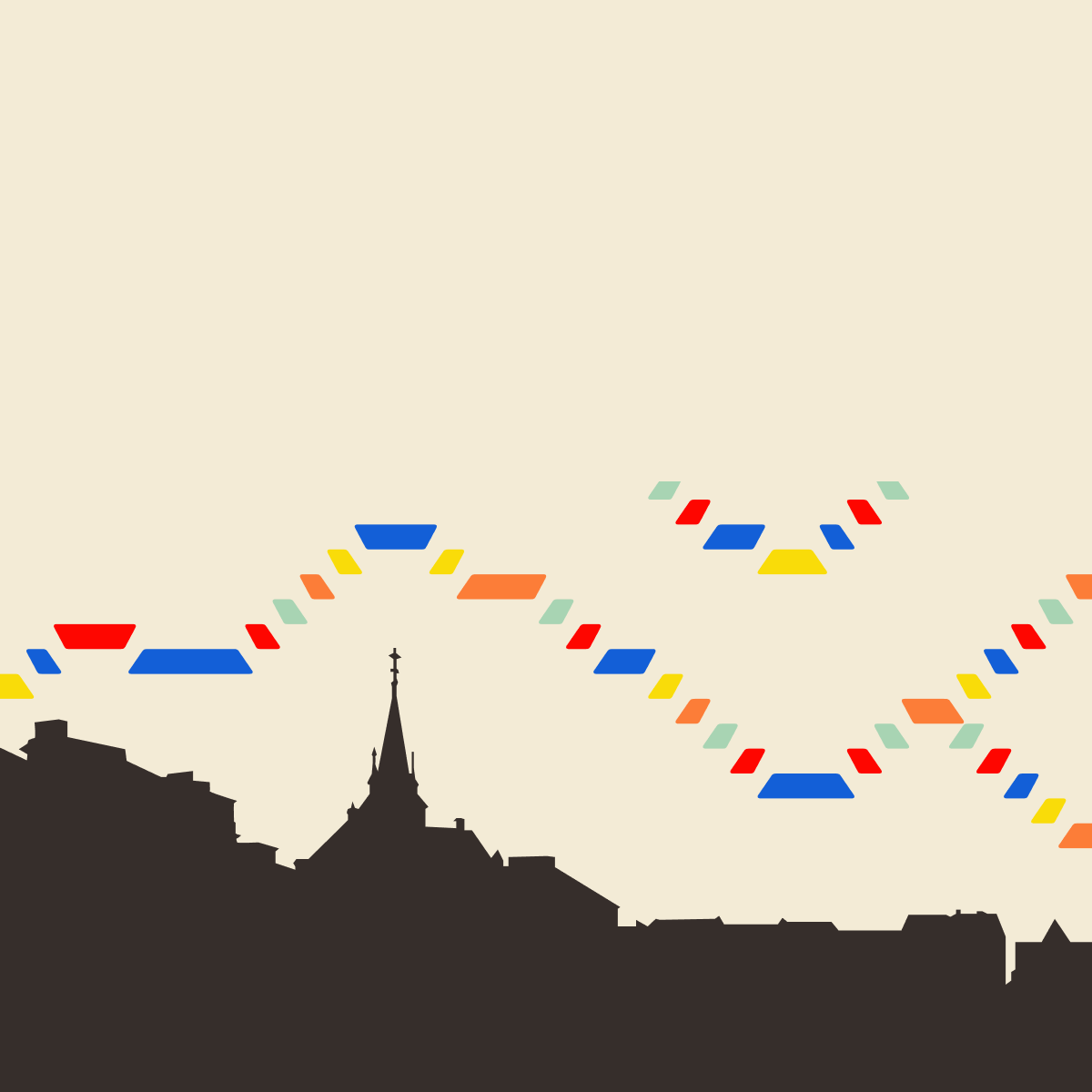
Stairs upon stairs Valparaíso is located on the coast of Chile, on a hill facing the pacific ocean. A common daily theme/struggle for both locals and tourists within the city is the amount of time spent on stairs, so naturally this became the visual anchor of the project.
The gift of fonts
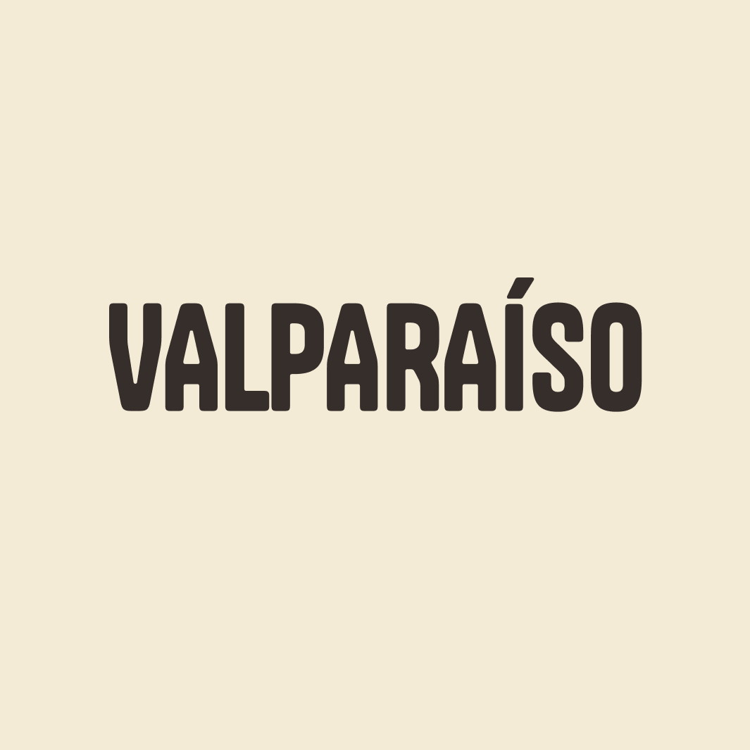
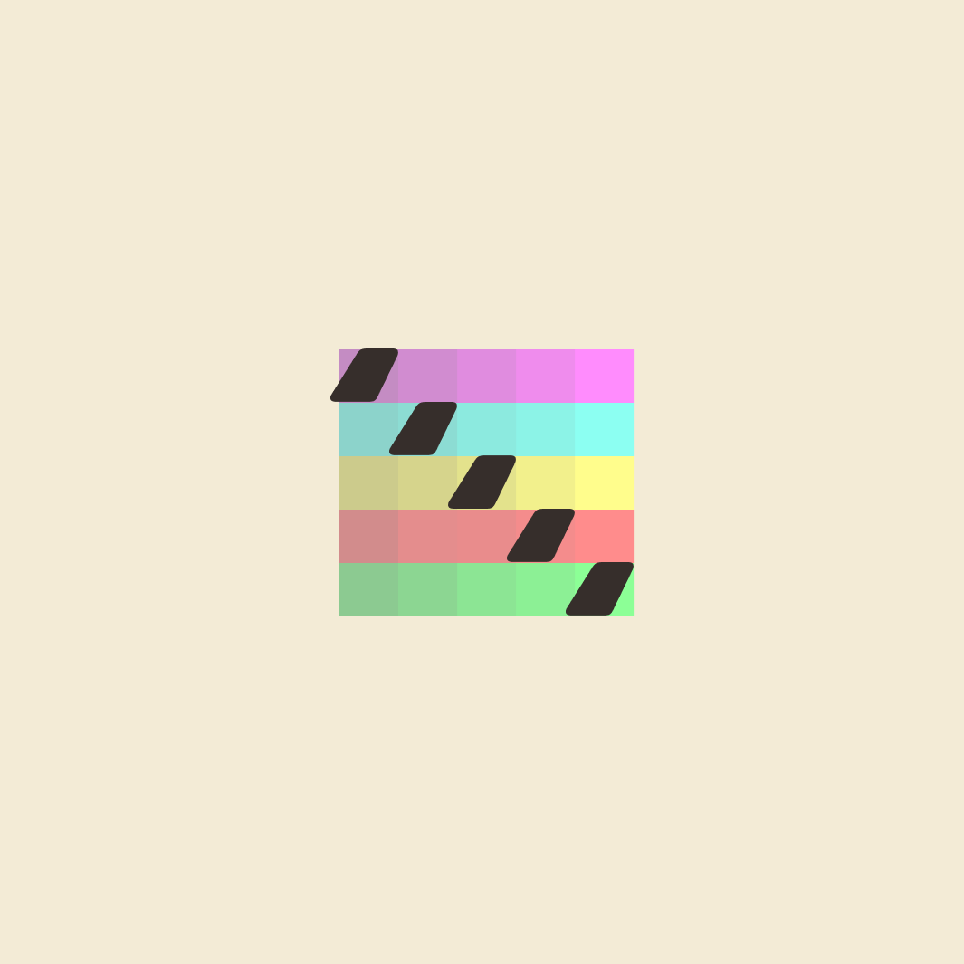
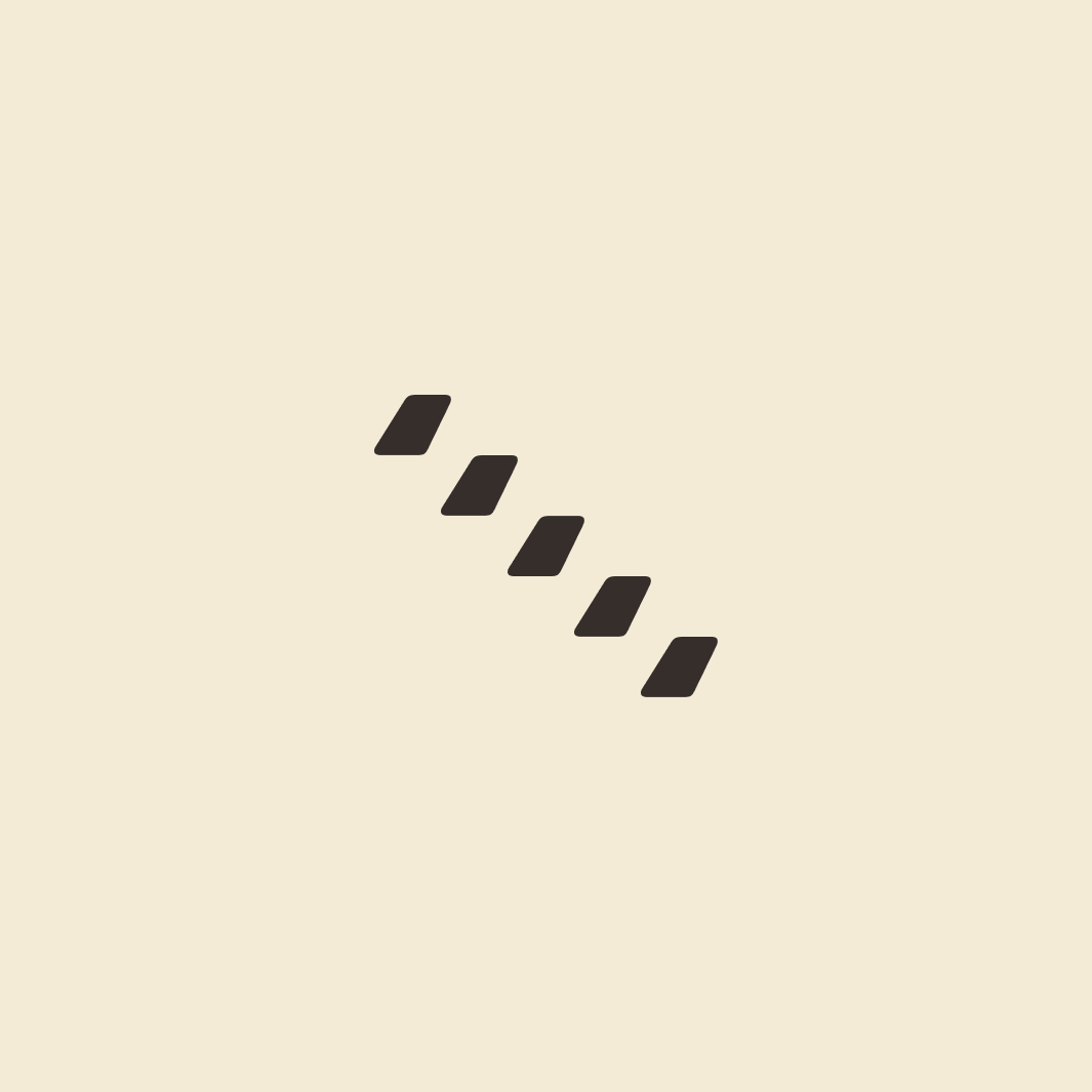
I knew I wanted to work with stairs. With that in mind i started looking at fonts. It occurred to me that the spanish name of Valparaíso has an "´" (accenté) in it. It became the steps in my stairs, and also acted as a way to honour the cultural heritage by using the original language.
Bohemian streets
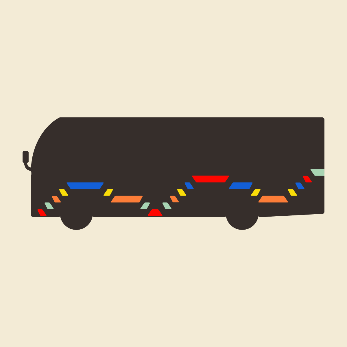
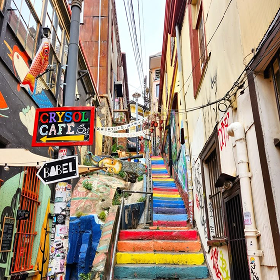
The streets of Valparaíso will offer you so much color, without even asking you. The city is filled with grafitti, semi-legal streetart. It's a visual explosion of impressions to step into. I colorpicked a few images and narrowed it down to five central + a black and a "white"
Final Product
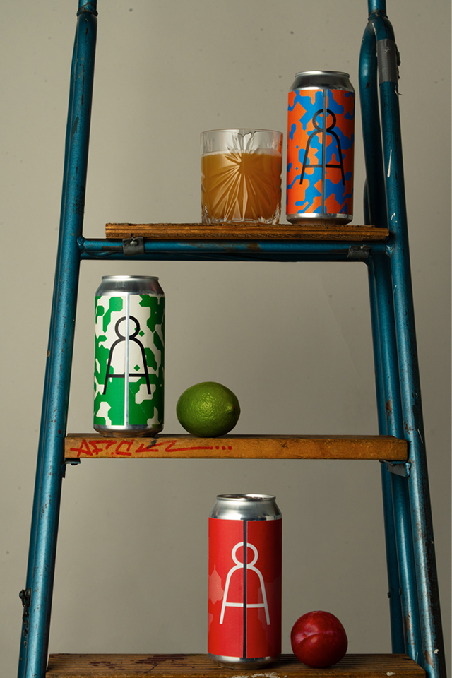
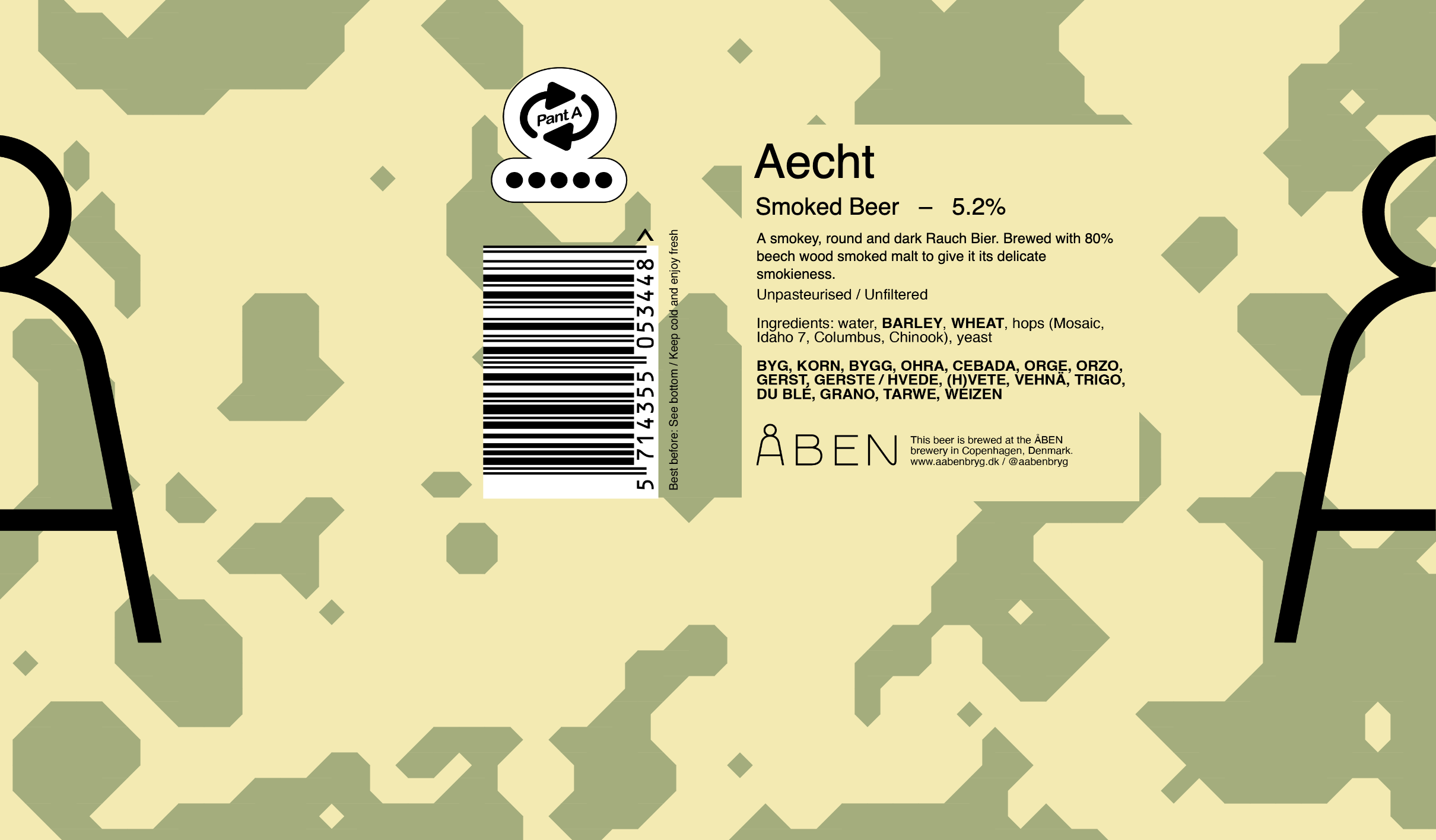
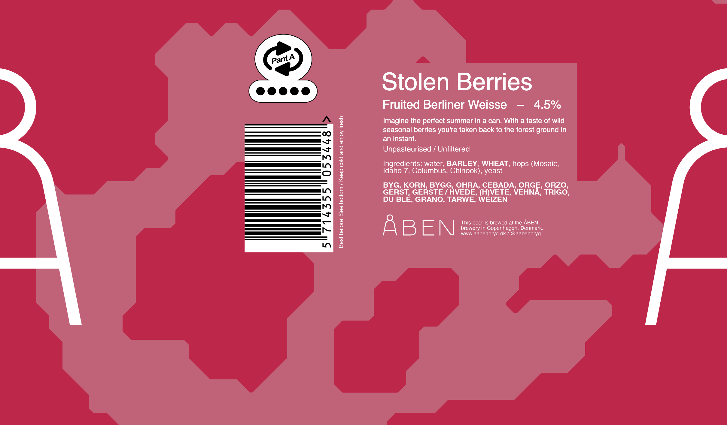
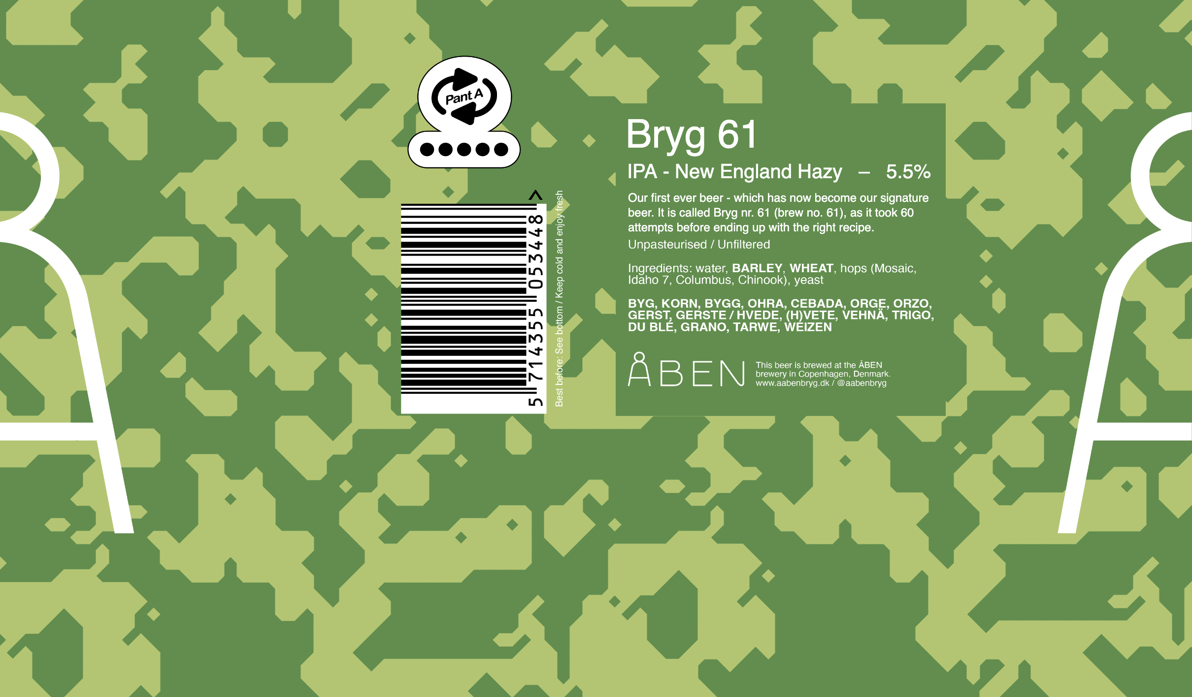
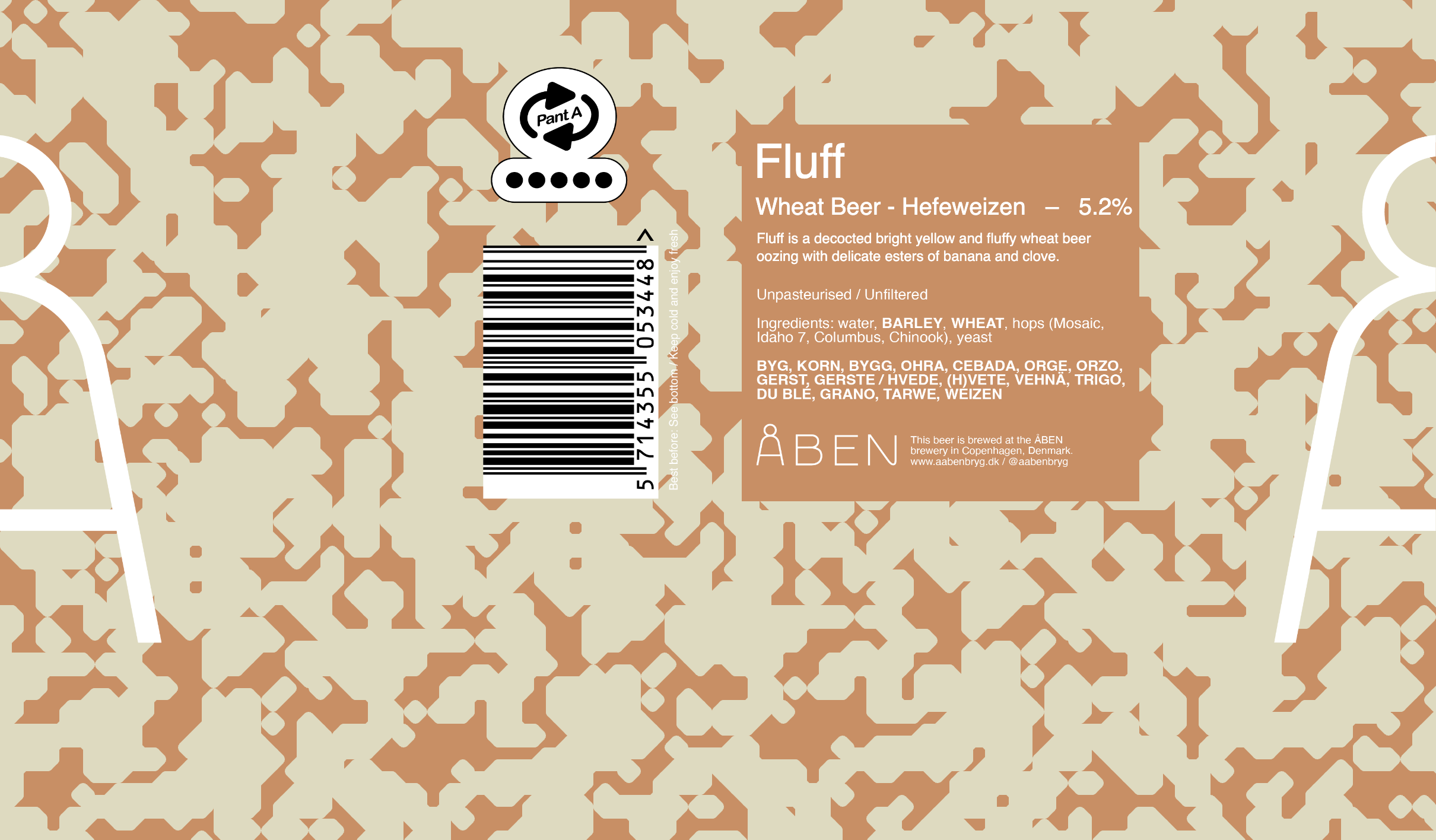
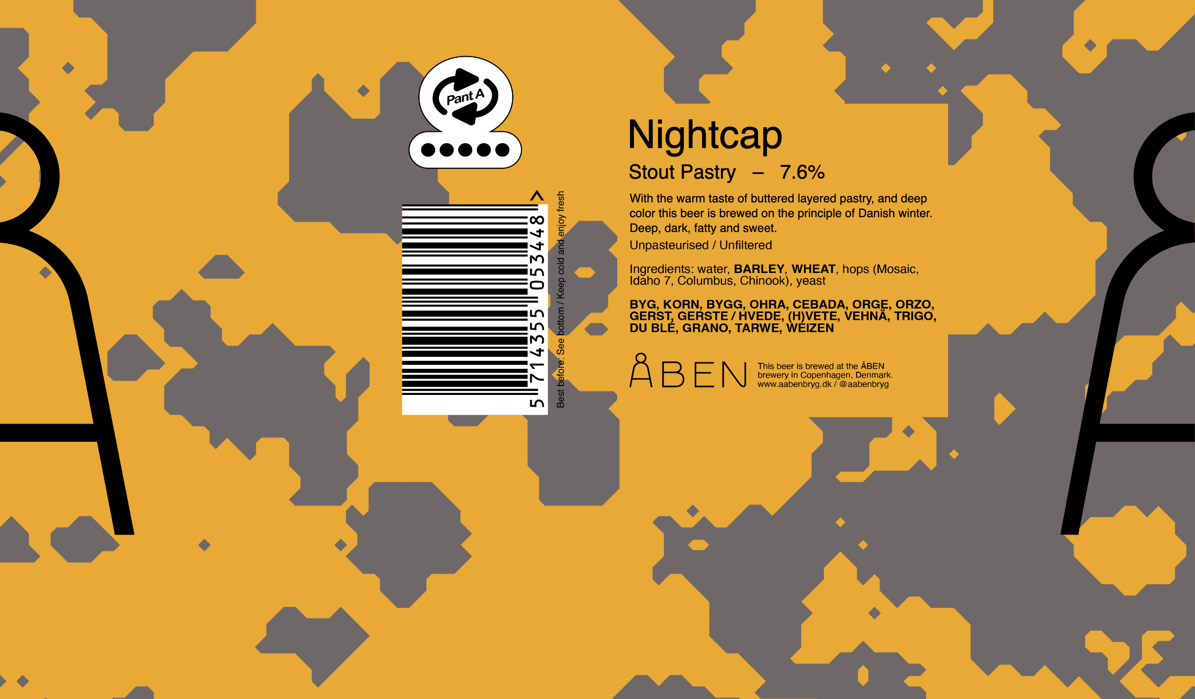
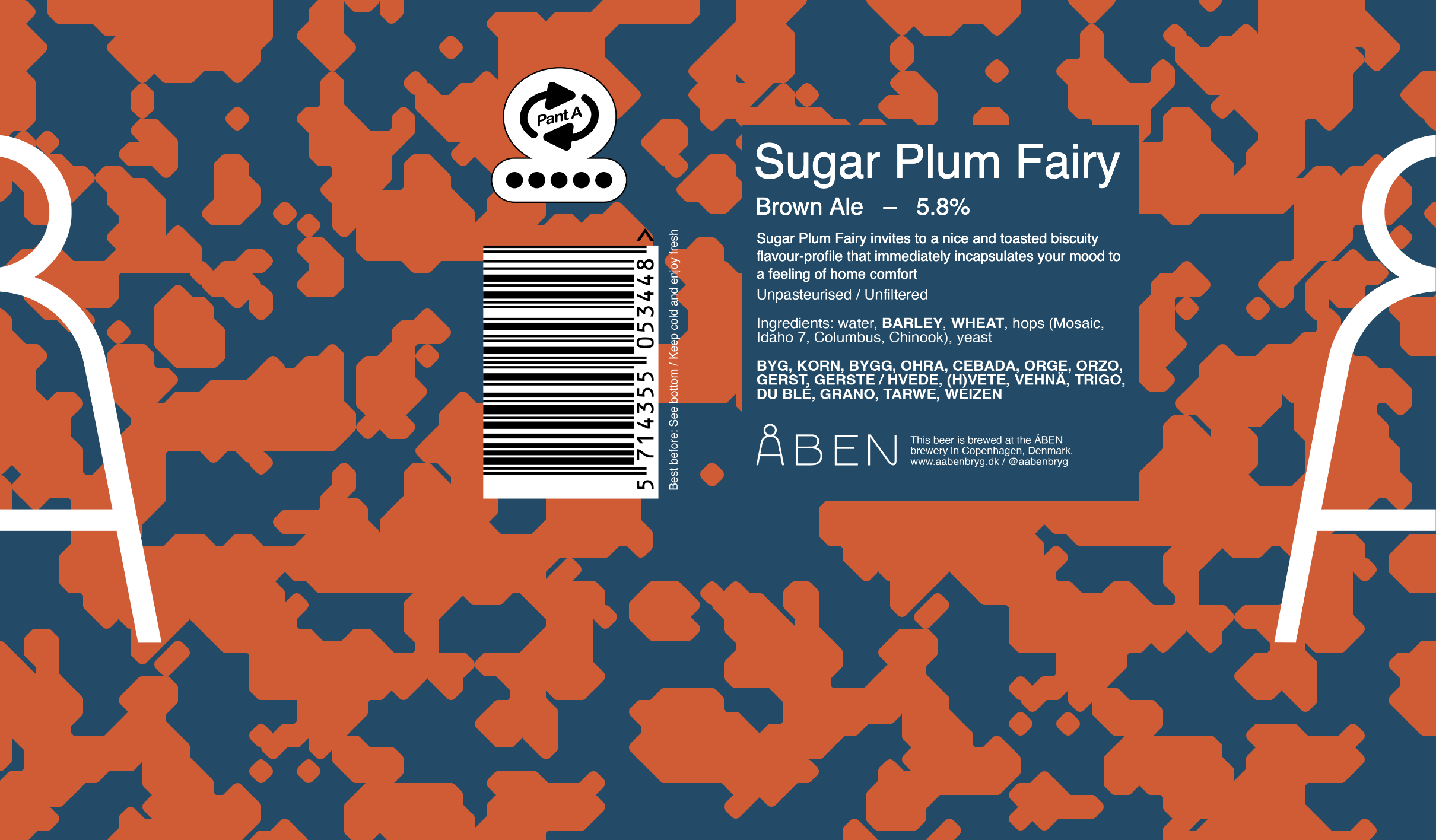
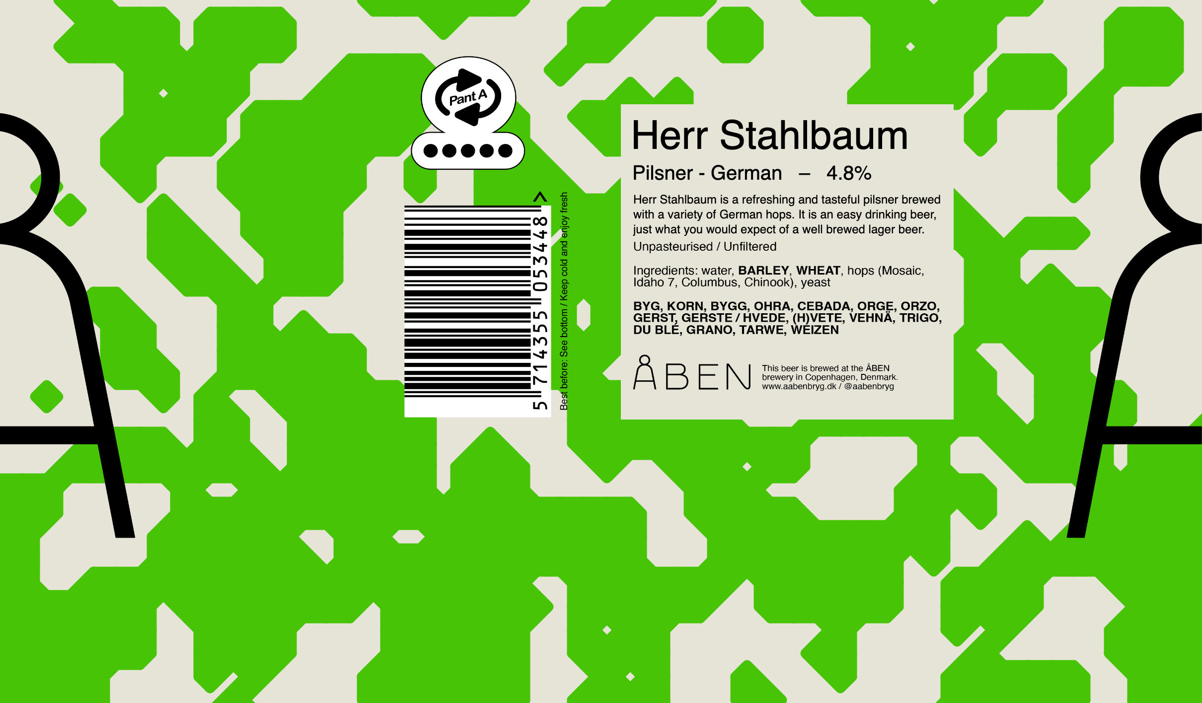
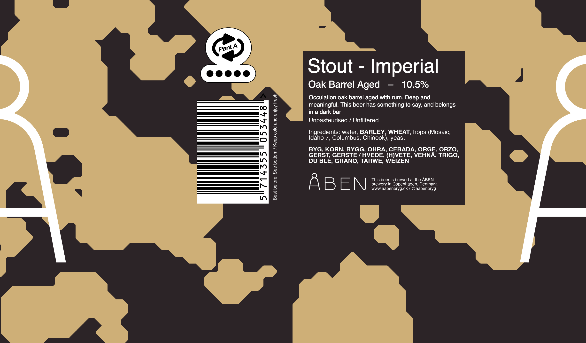
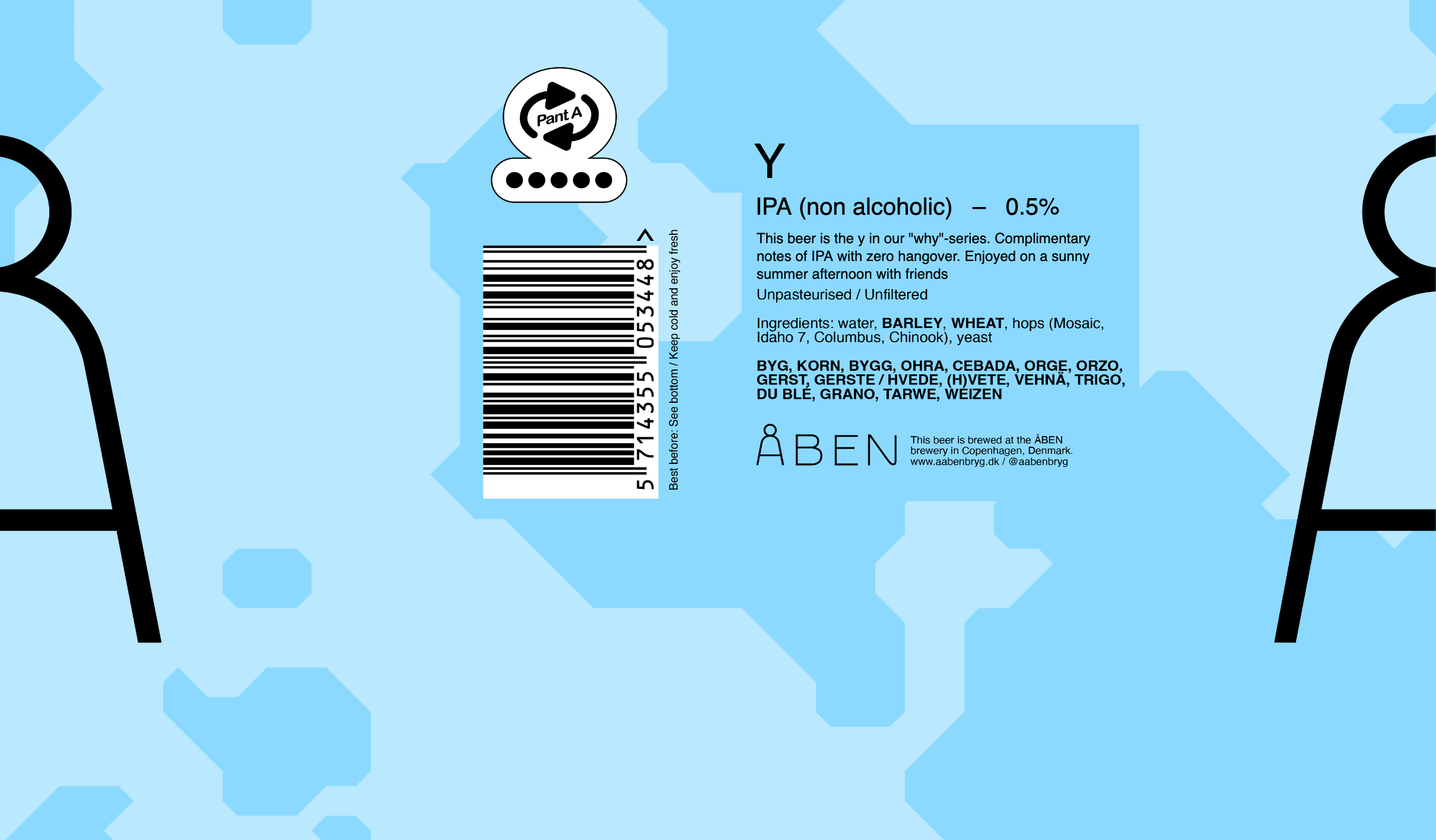
The generator
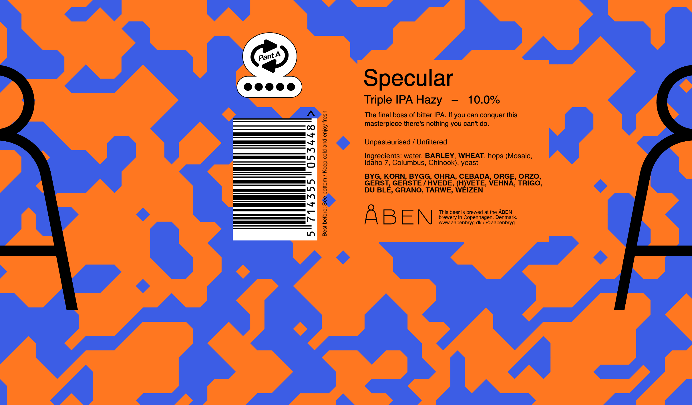
The generator is made with p5.js. The user is able to create the pattern they want within my design-system using sliders that control the cell size, noise and stroke-size. I applied a minimum and a maximum for each slider, so that the design-system doesn't fade. User can also change colors, write textfields, edit the pattern or have the option to click "RANDOM" until a desireable pattern shows. At the end of the process, you can export the canvas as a png
Try it out for yourself below:
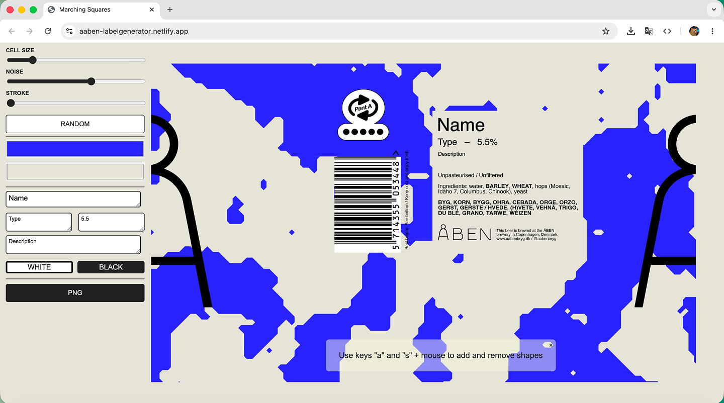
The label generator is a desktop experience. Visit on a computer to try.
The concept of a generator
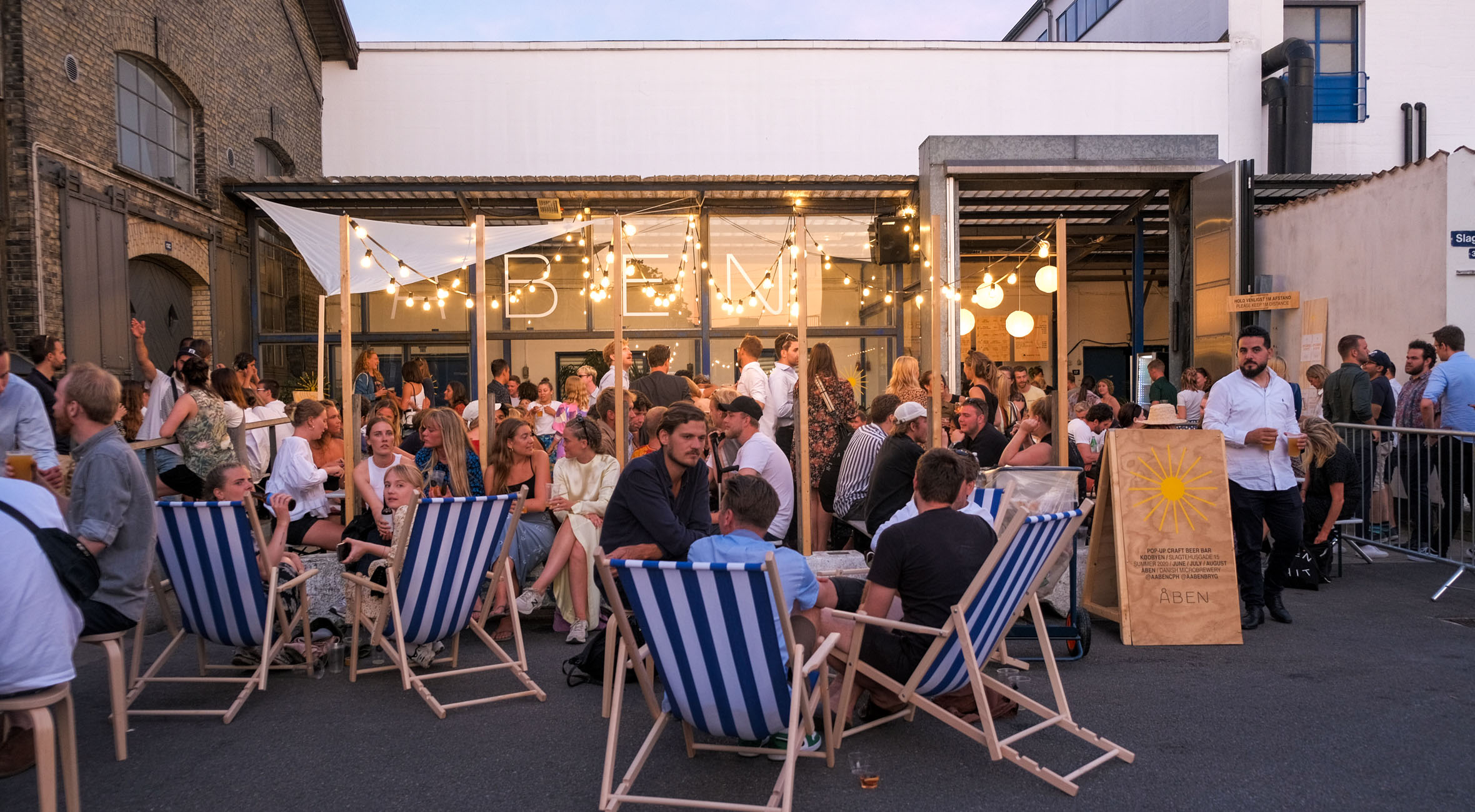
My teacher, Stig – while beign a talented teacher, is also the biggest craft-beer enthusiast you can ever find. He reached out to ÅBEN Brewery and got talking with their communication-department. Upon learning it's one person doing all the graphics of SoMe, website, labels etc he offered them our skills – they accepted.
The focus of the assigment was to create a simple one-stop-solution for the creative department of ÅBEN Brewery. Something that maintains a design-system, while being open to change and editing.
The chemistry of craft beer
After my teacher, Stig's passionate presentation about craft beer, I was very fascinated by the amount of detail in the chemistry of craft beer. The attention to detail required to acheive certain flavours or types of beer, was very impressive to me.
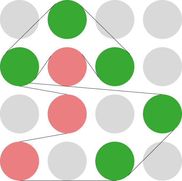
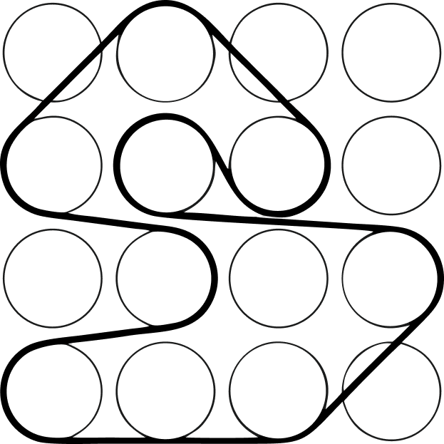
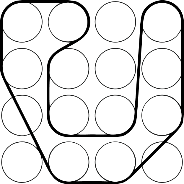
This was my direction. Molecules, blobs, chemistry.
The chemistry of craft beer
After my teacher, Stig's passionate presentation about craft beer, I was very fascinated by the amount of detail in the chemistry of craft beer. The attention to detail required to acheive certain flavours or types of beer, was very impressive to me.
This was my direction. Molecules, blobs, chemistry.
Showreel
My showreel! A collection of some of the things I've made. Edited in After Effects, music by Nu Genea
Videnskab.dk
Solo exam assignment. An explainer made for Videnskab.dk about oxygen depletion in the Danish fjords. Very important subject, that was to be communicated as teaching material for the age-group of 10-14 years old.
Hero Image
A hero image belonging to the exam project of Videnskab.dk.
Microglia
Group project. A scientific explainer that explains the nature of 'Microglia'. A substance whithin the human brain, that has comlpex behaviours.
Valparaíso, Chile
Solo project. Motion graphic made to show the visual identity and design system behind the coastal city.
Solen Går Aldrig Ned
Solo project. "The Sun Never Goes Down" – a hobby-project where i helped a friend make the title sequence for his short film. See the full film here
Film course
Group projects. We had a 4-week course in filmmaking. We made two different. One with real cameras – one with smartphone.
Spoiler: the smartphone-film is best!
My camera-roll
A project i made in relation to the admission test to Danish Royal Design School (KADK)
Spoiler: I didn't get in!
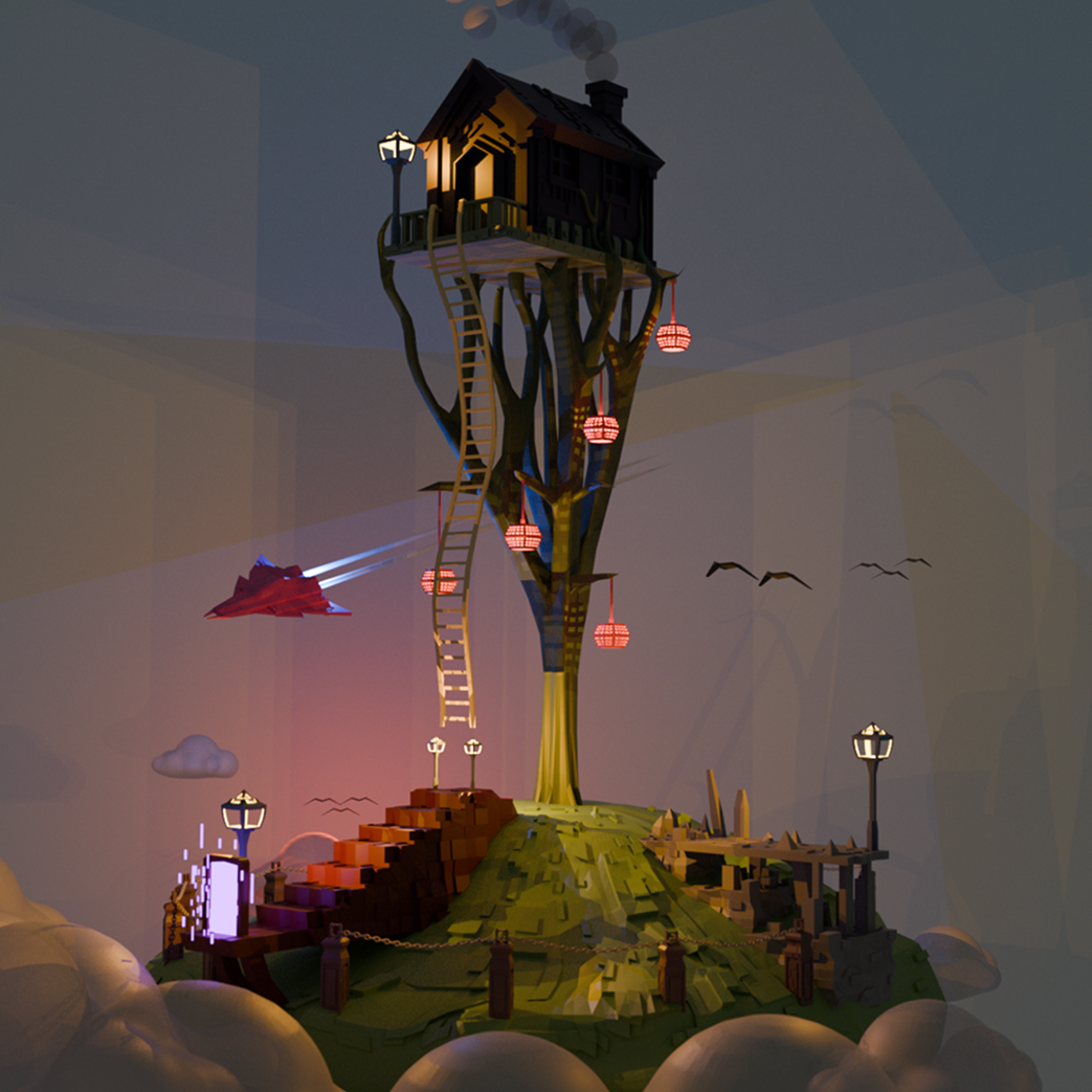
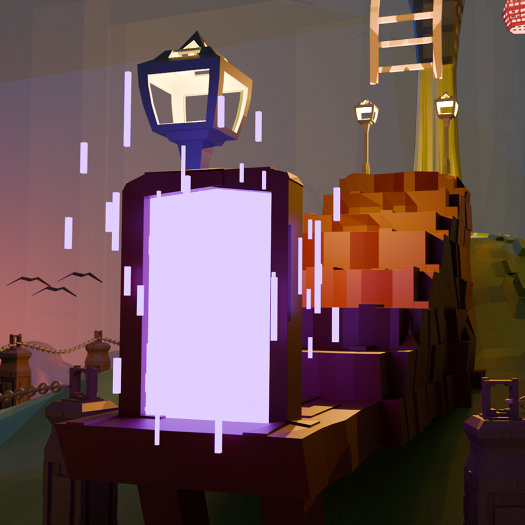
Final renders:
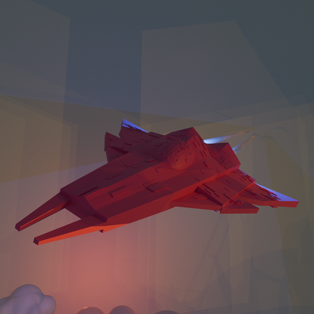
click for full size
Anything goes...
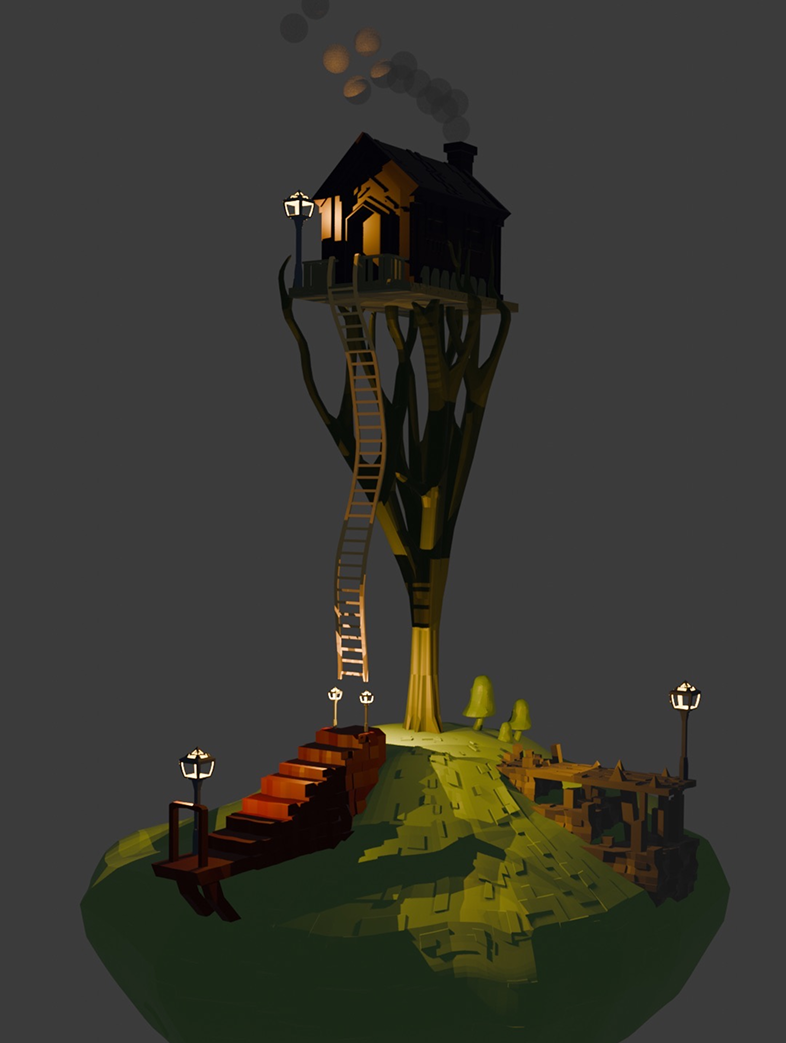
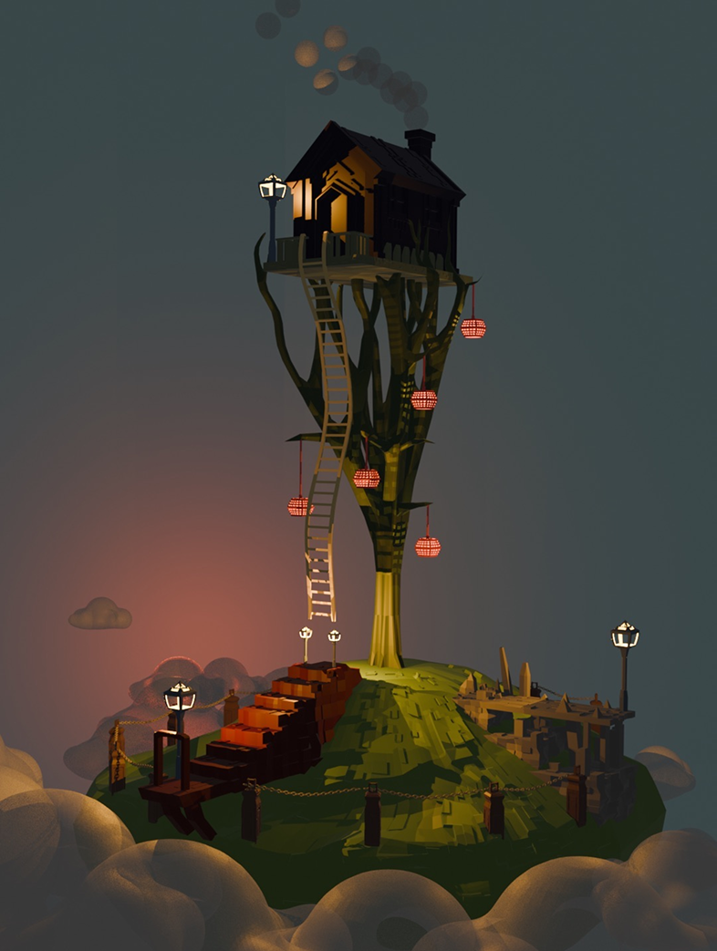
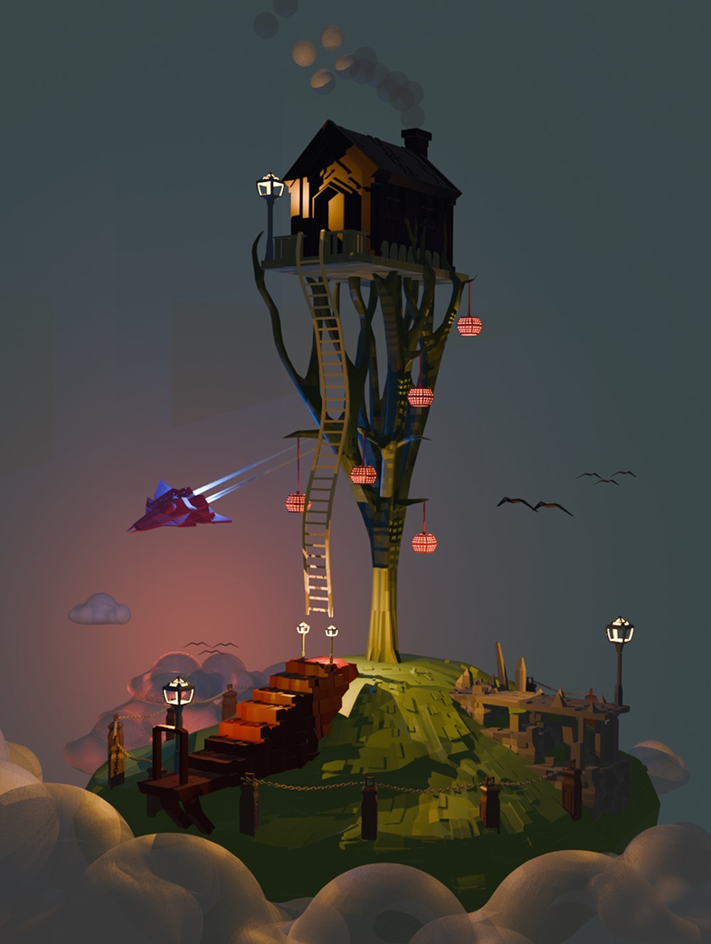
We had a 4-week intro course to the world of blender. A lot about modelling, shaders, textures, lighting and render-settings. The final assignment given was to create a fictional island. Anything goes – as long as it’s an island.
Beginner’s level
Over the course of our course I got really into the modelling aspect of blender. Not a single element in my project was neither downloaded or imported. I built everything myself. I feel like it also says a lot about my level of 3D at the time, which was practically nothing… I focused on one thing, and it pushed me in a stylised direction of low-poly geometry.
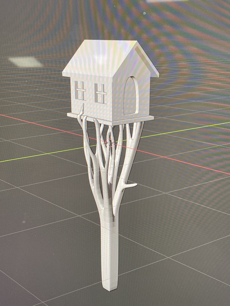
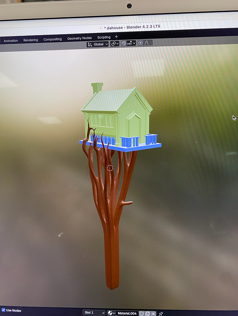
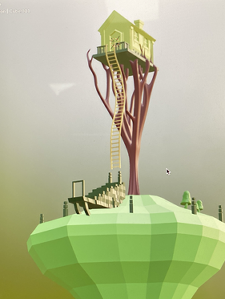
Storytelling
As I kept working on this project, I kept adding more and more things. It slowly became an assignment in storytelling rather than blender. “Who lives in the house? Why is the island floating? Where does the portal lead? And what the hell is that plane???” But i guess that's the fun part too.
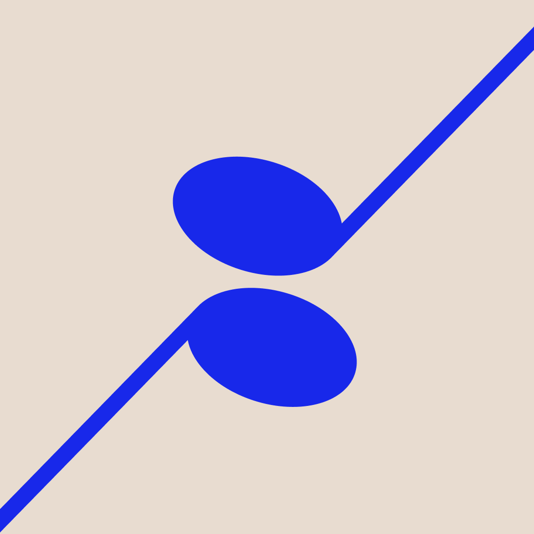
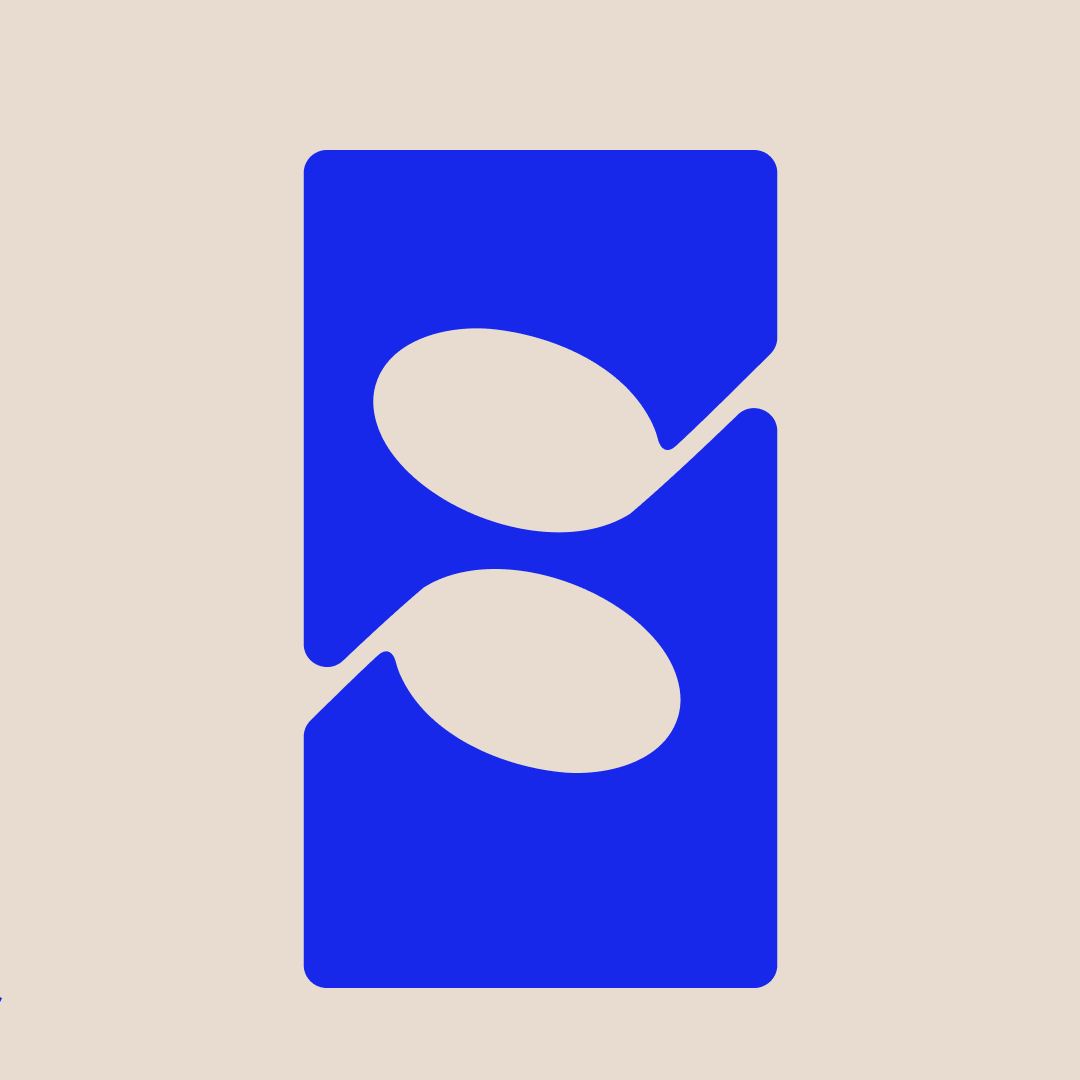
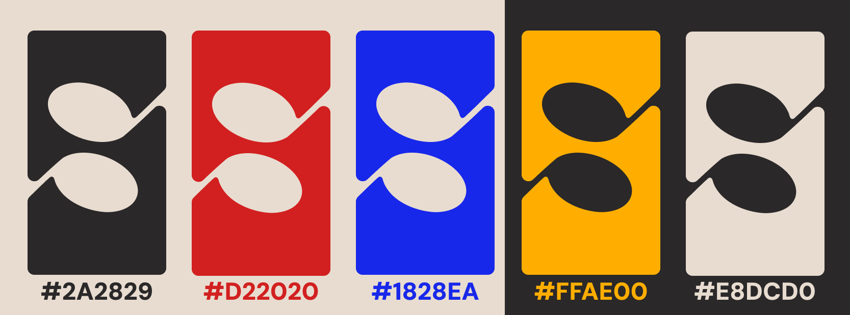
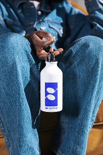
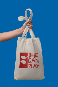
The logo is based in two musical notes – meeting and cutting out an 'S' for She Can Play.
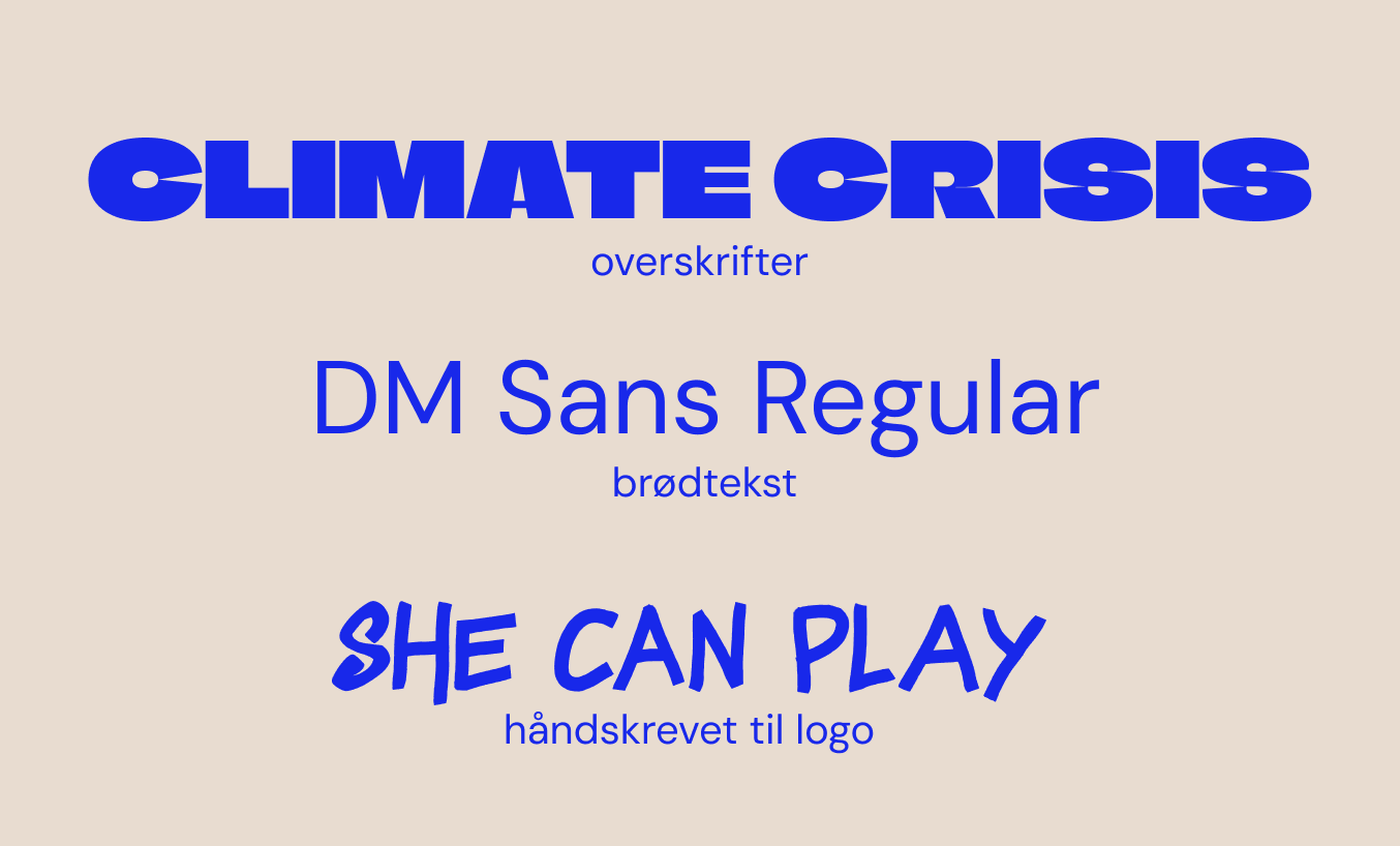
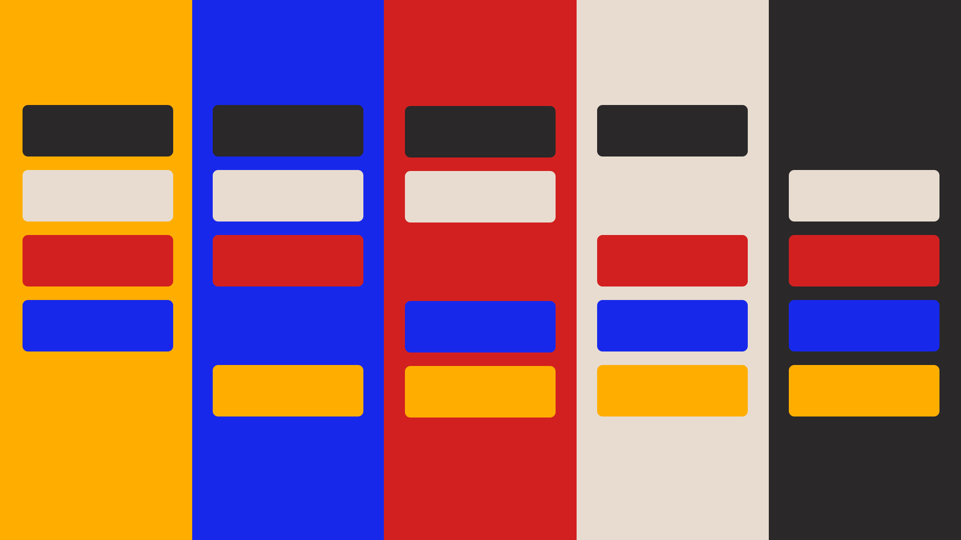
Colors and fonts balances both volume and seriousness.

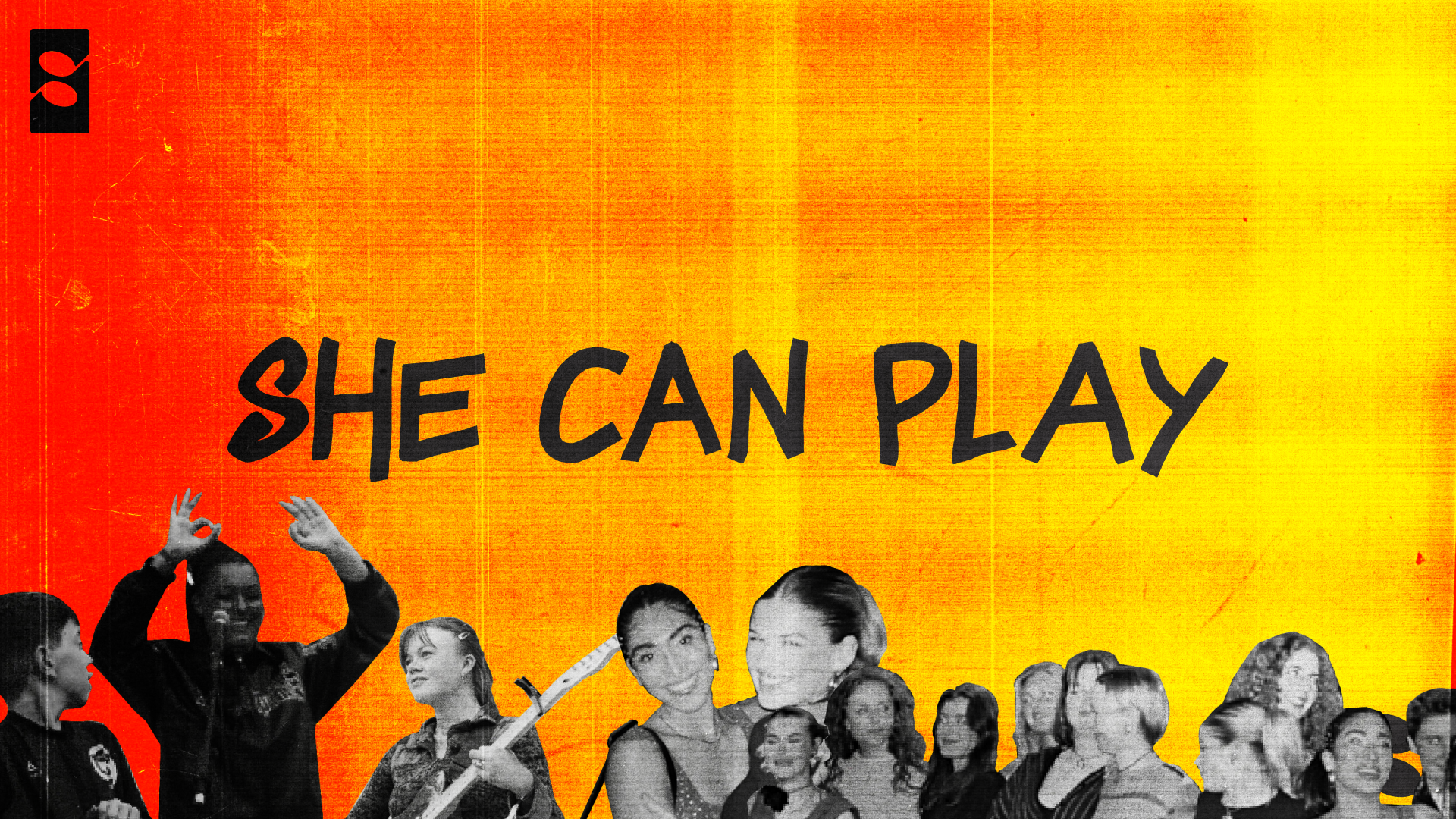
The collaborative
She Can Play is a musical collaborative and community for women and gender minority in the music industry. The mission of the community is simple. It's a safe space for women to develop their musical talents and to form connections and relations. The identity they had before was a little quiet and undefined, so we got as a group assignment to create a new identity in two weeks.
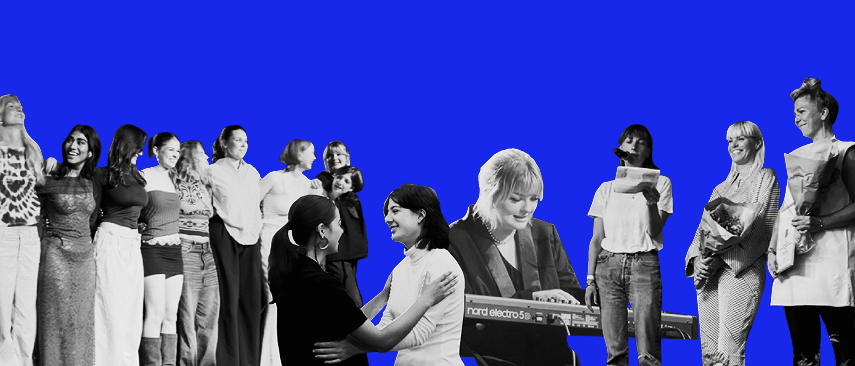
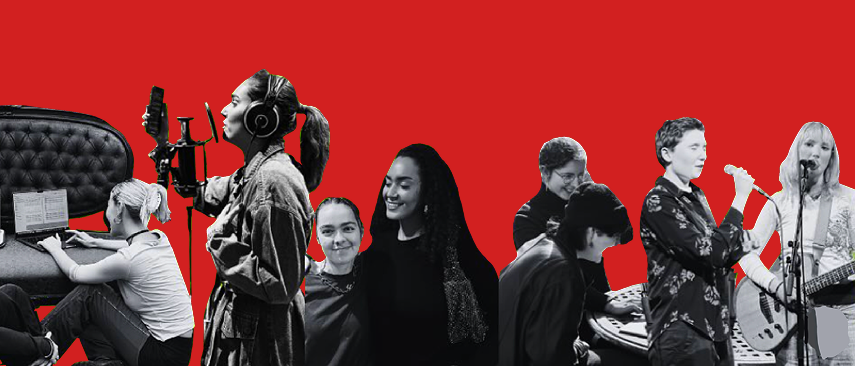
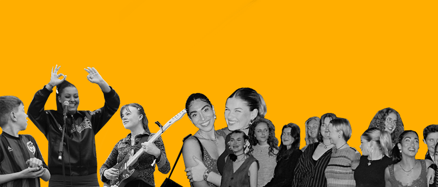
Rebels
My group, and I, quickly fell in love with the rebellion-like attitude towards the music industry. To challenge the norms, to dare to be different and to give a chance to someone who would otherwise get overlooked. To visualize this 'diamond in the rough'-feeling, we applied an overlay crunchy texture to almost everything we did.
All in all...
A fun two week project. They did not end up using the identity, but I'm still proud of what my group and I acheived. Check out their old identity on their website:
She Can Play
When pressed – the tree grows mroe digital and corrupted, slowly turning into a digital dystopia of a tree.
Not pressed – the tree slowly goes back through its original stages, and returns to being a functional, living and breathing organism.
Stage 1 – Healthy
Stage 2 – Half corrupted
Stage 3 – Fully corrupted
Full transitions
To use projection mapping as a communicative tool
The assignment was to find a client or an organization, who has a central message. Come up with an idea, that through projection mapping, communicates a message in line with the organization picked.
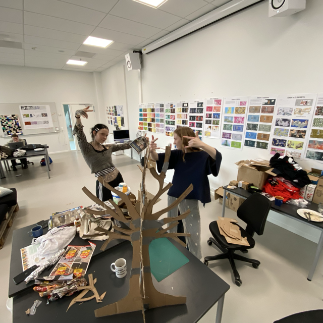
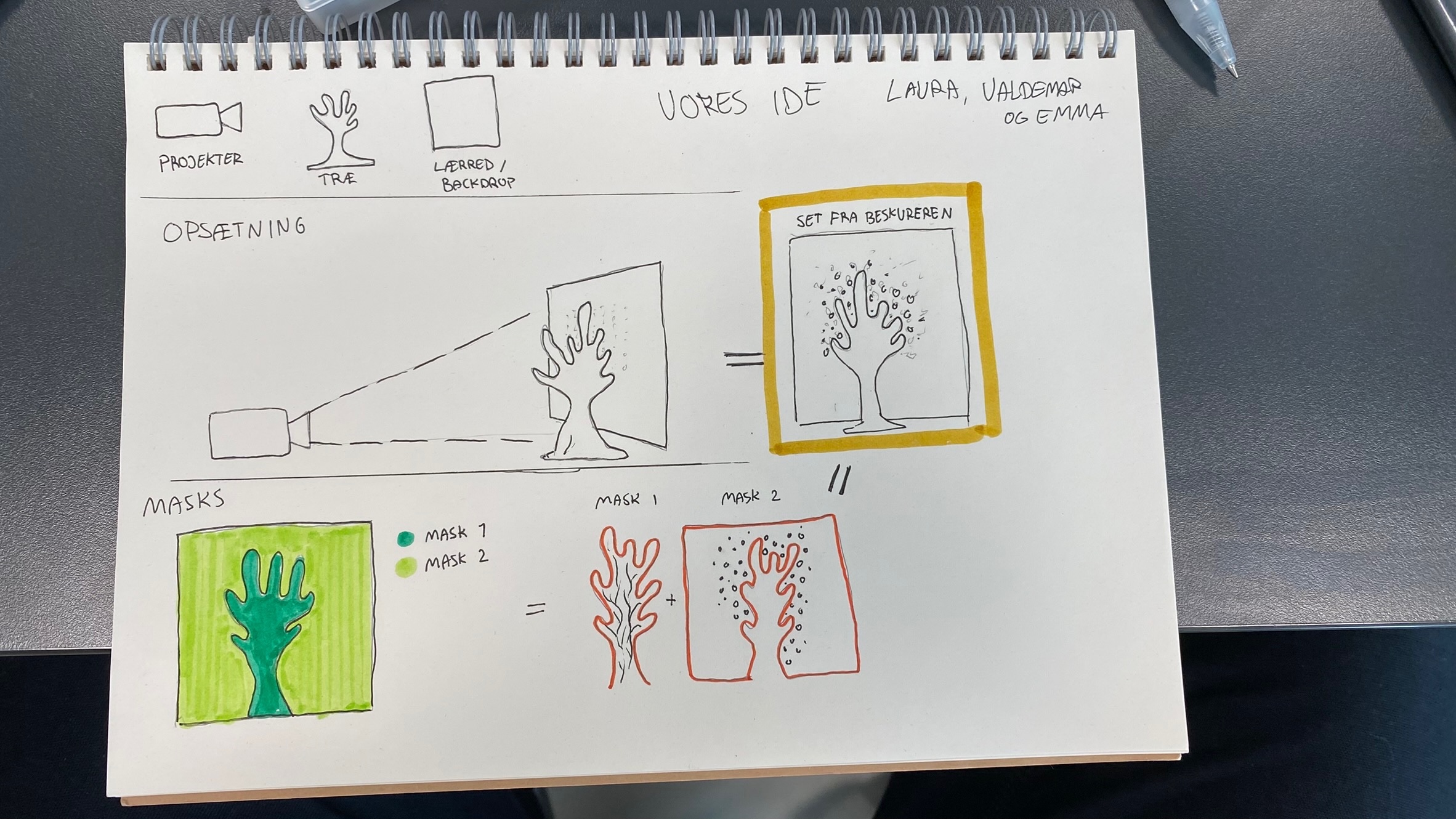
My group and all wanted to build something with our hands. Get dirty and craft something. So we started with the idea of a tree.
The client
We brainstormed upon our idea, and zeroed in our client being Democracy X. Democracy X is an institution that is the remnants of 'Teknologirådet' and 'DeltagerDanmark' put together. Their focus points are technology, society and sustainability.

The build
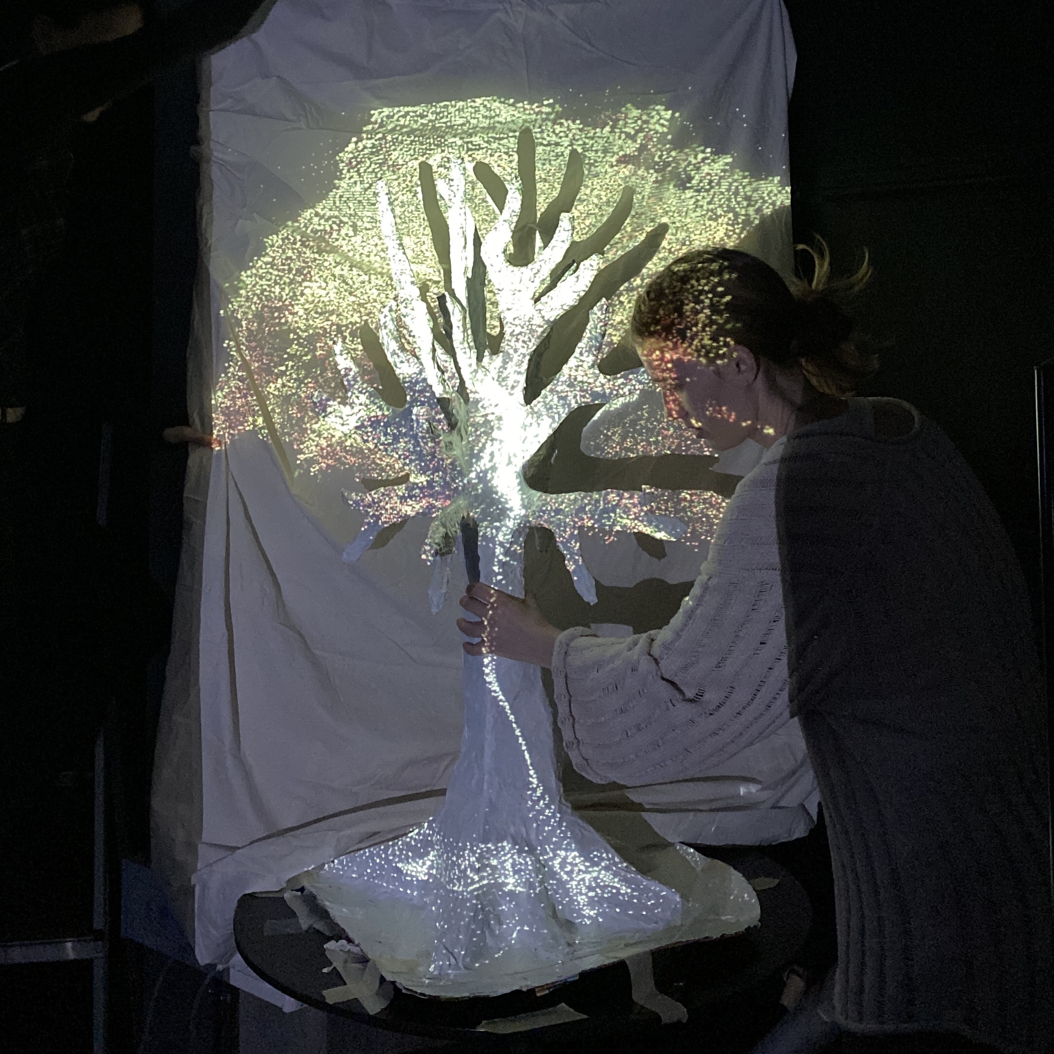
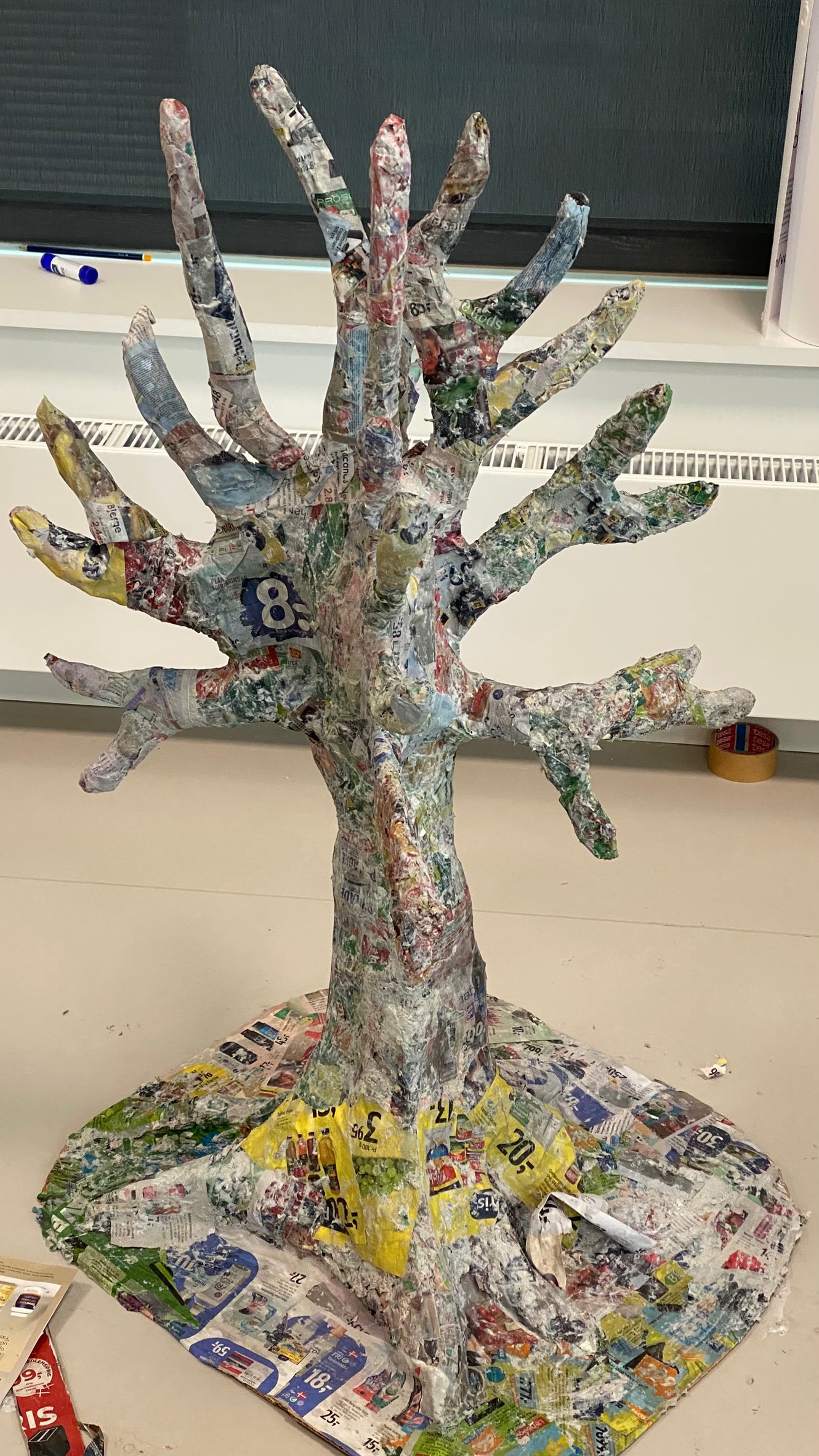
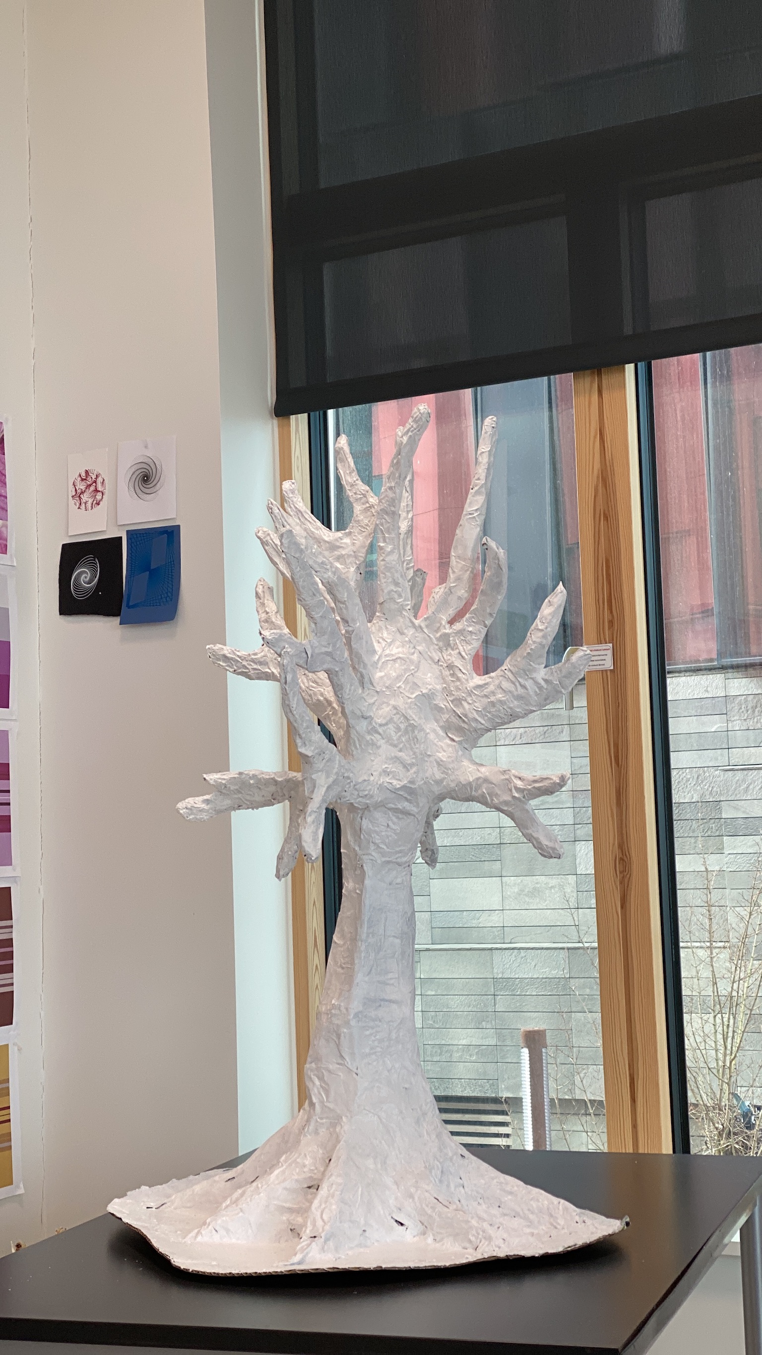
With a structure of cardboard, wire, tinfoil, newspapers, glue and other things we could find our tree was ready to be painted white. We 3D-scanned it and went digital from there.
A new experience
Working in TouchDesigner was a first for everyone in my group, including myself. But through trial and error, we took our 3d model of the tree, extracted coordinates and set up a particle simulation.
Interactivity
To emphasize the message behind Democracy X, we wanted to narrow down our idea:
"By not using AI and tech – nature revives"
This then became the central theme for the project and the foundation of our interactive element. A key on a MIDI-keyboard became the symbol of technology's interference with nature.
The process: